koti hakone


koti hakone
2024
箱根の中でも自然豊かな高原が広がる仙石原に位置する保養所を、宿泊施設として再生する計画。
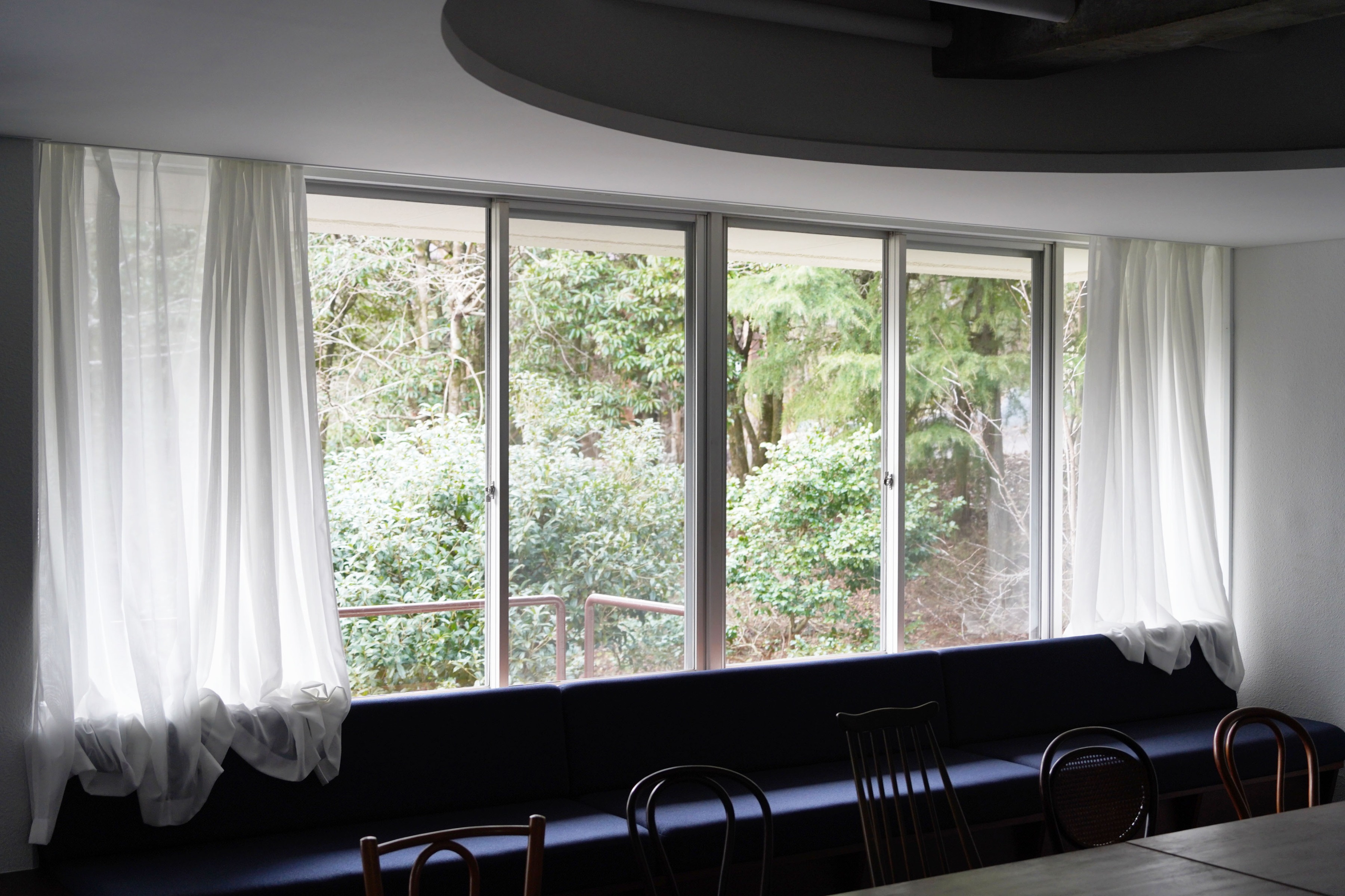
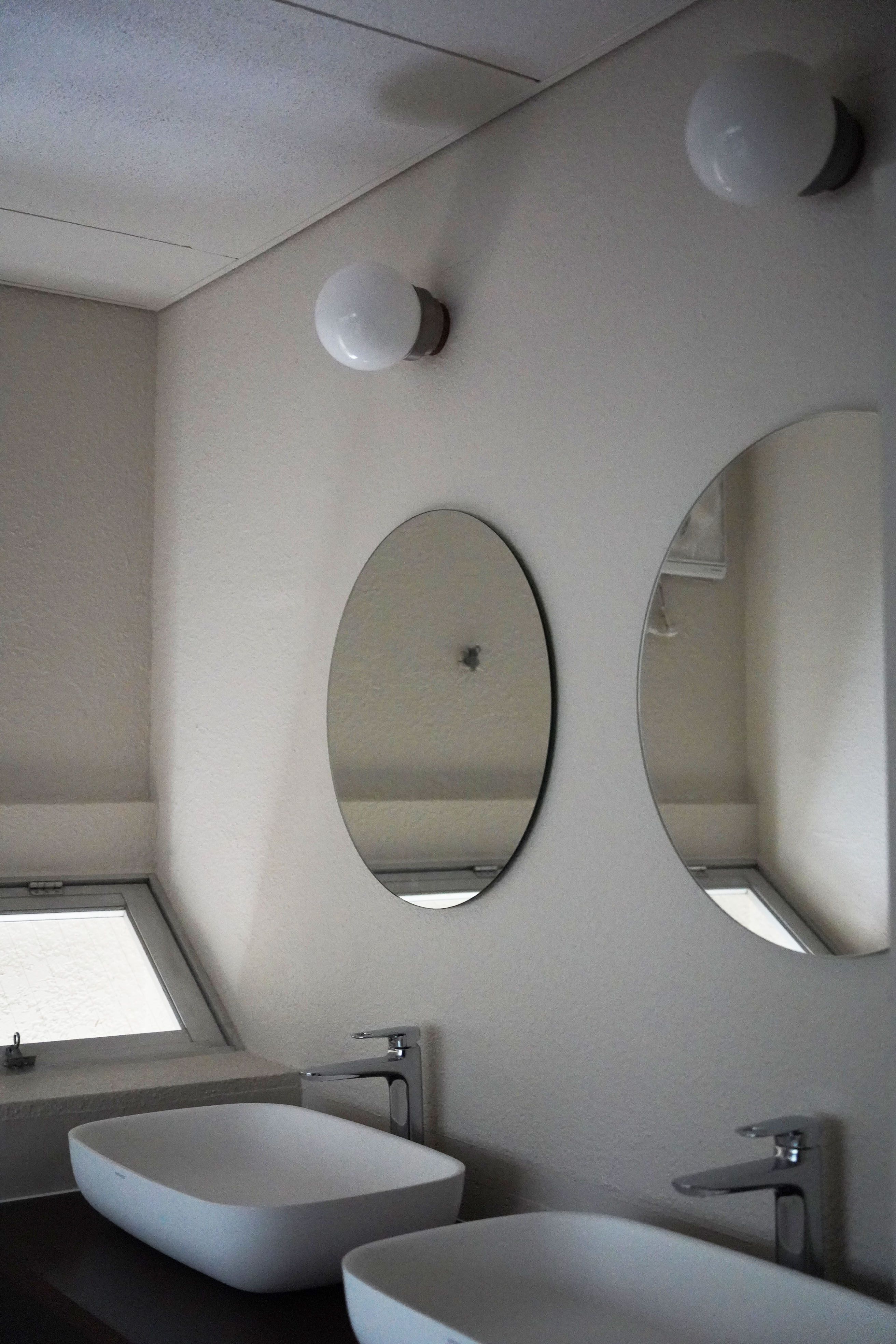
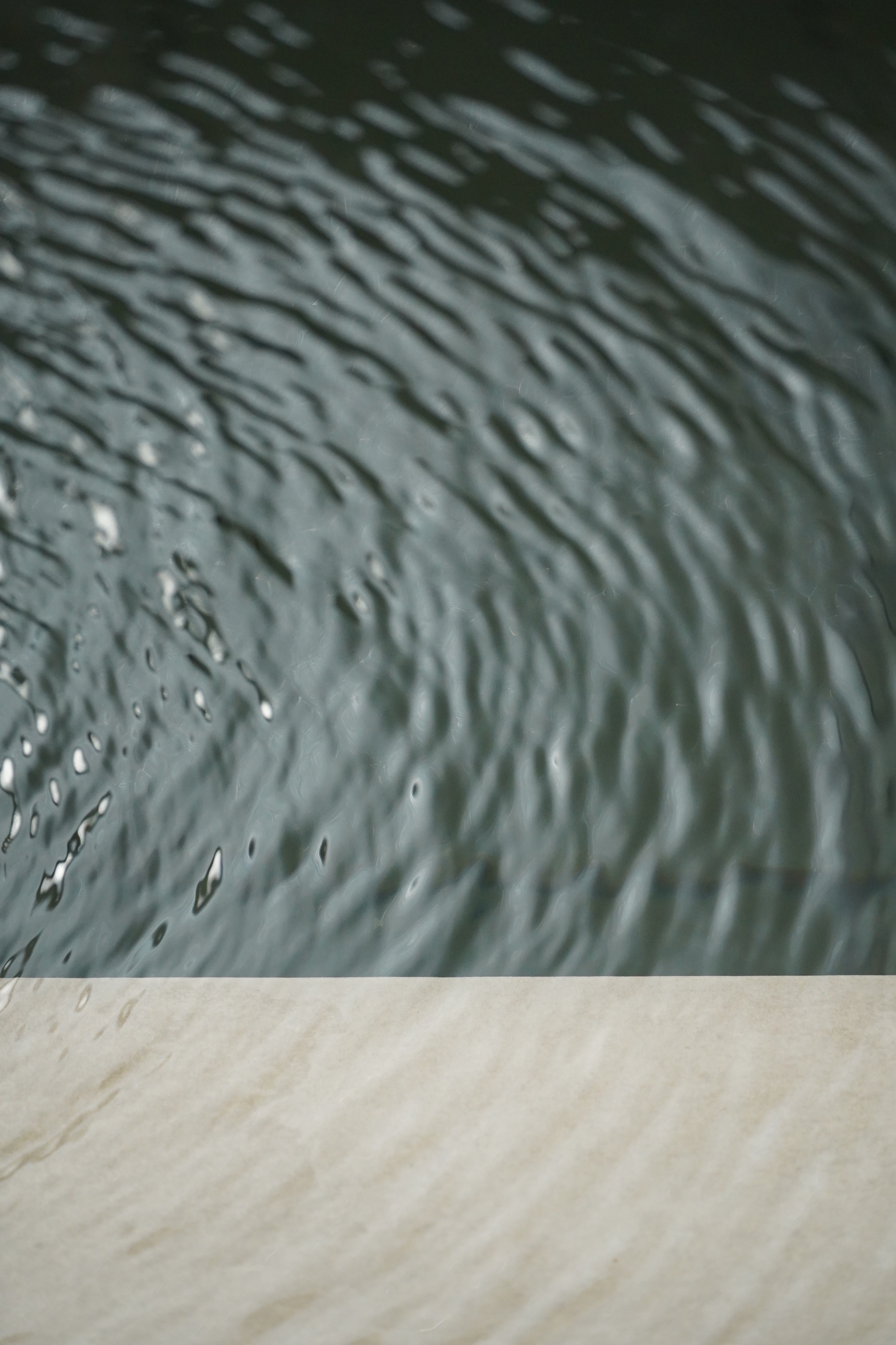
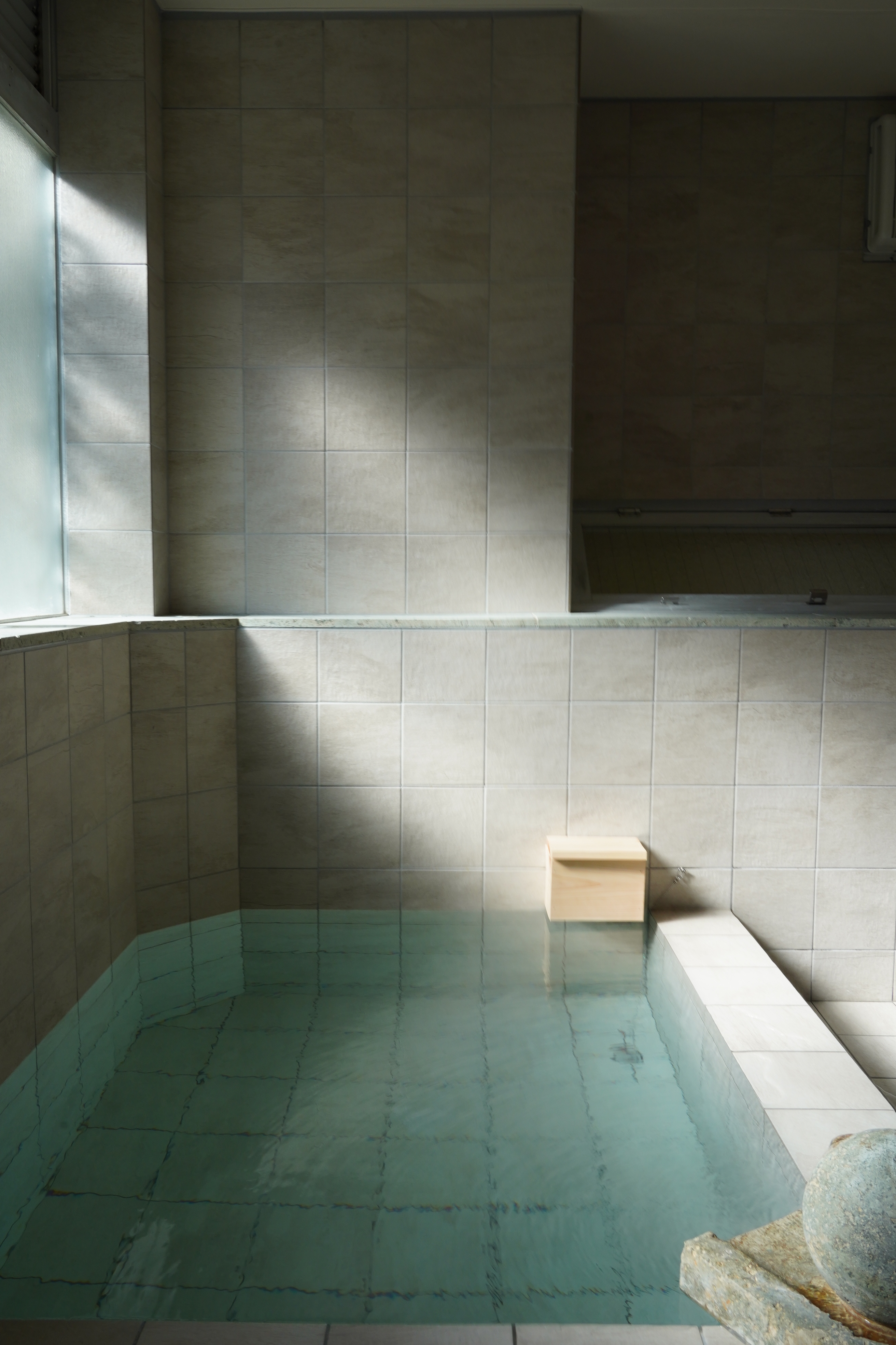
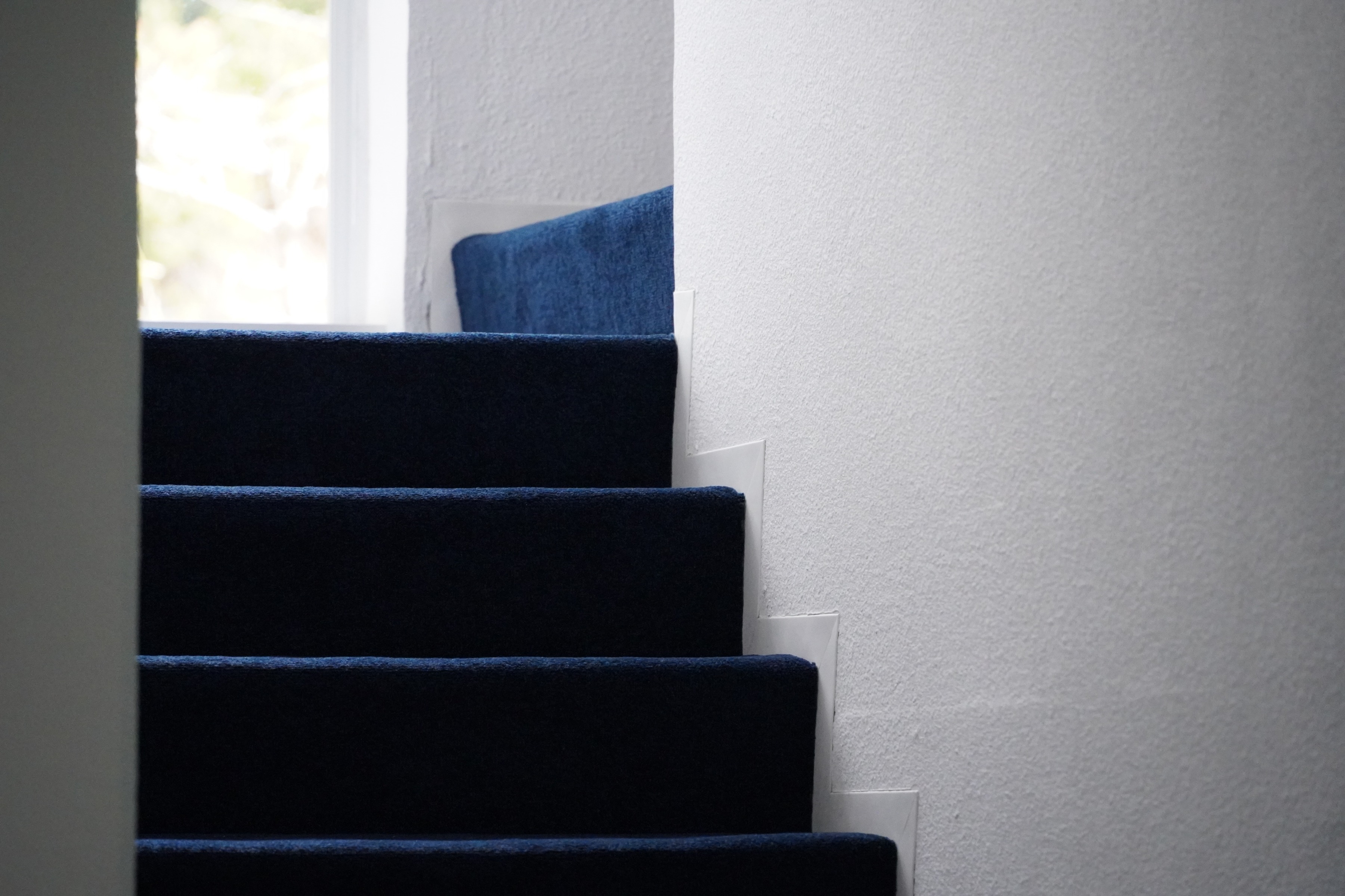
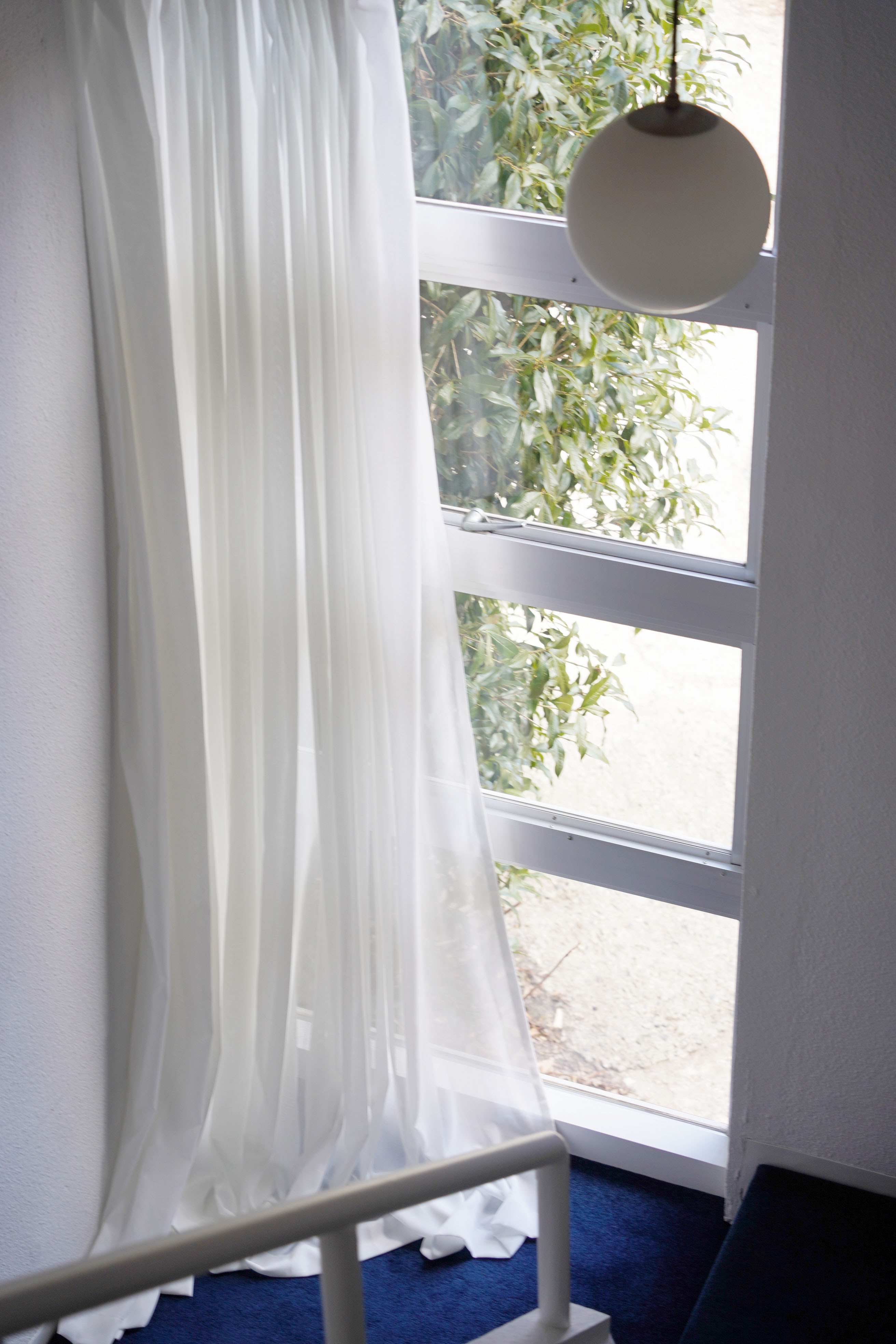
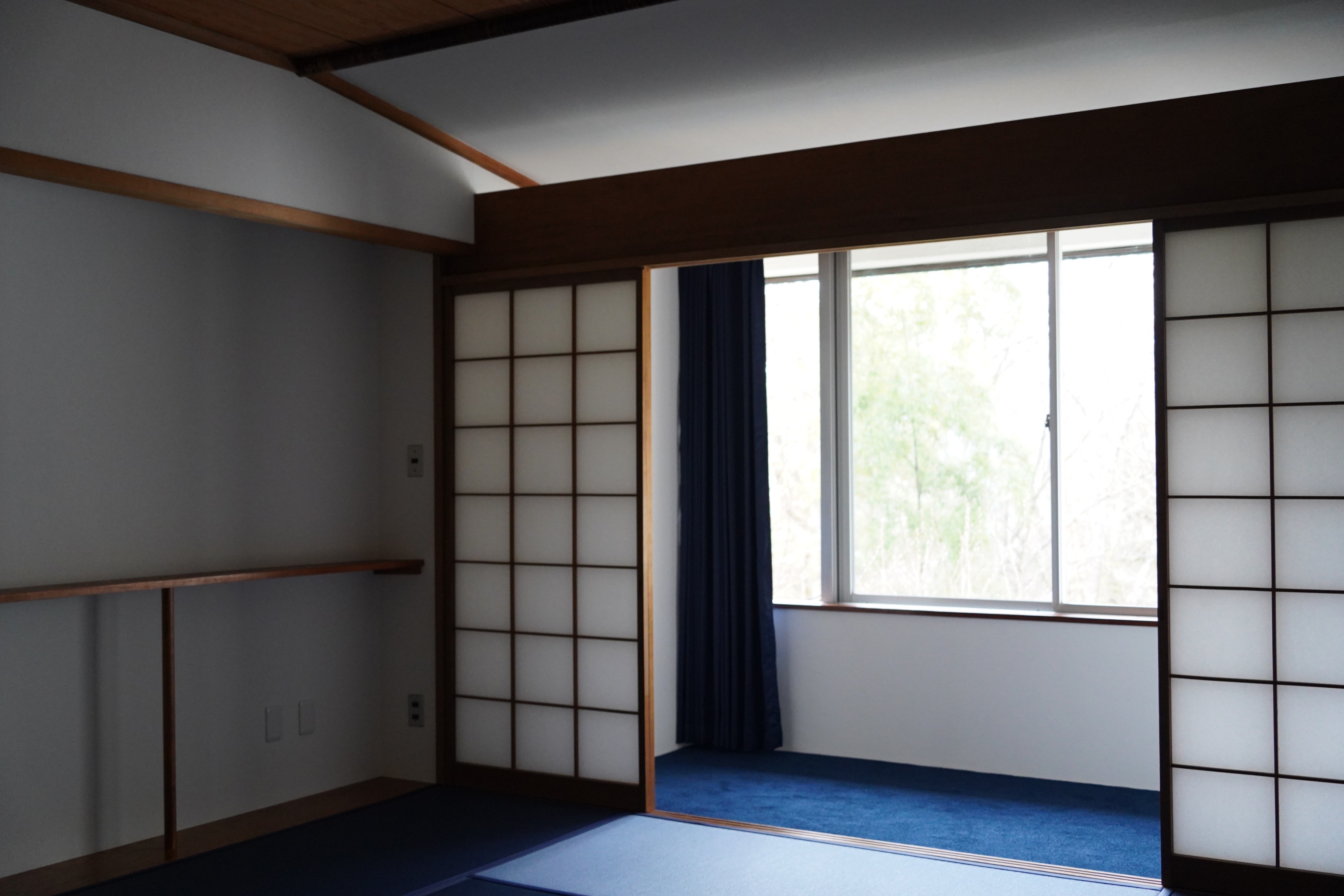
暗がりになりがちな廊下には北側からのハイサイドライトが設けられ、浴室にはアンダーライトで自然光を柔らかく取り入れる工夫が施されていた。
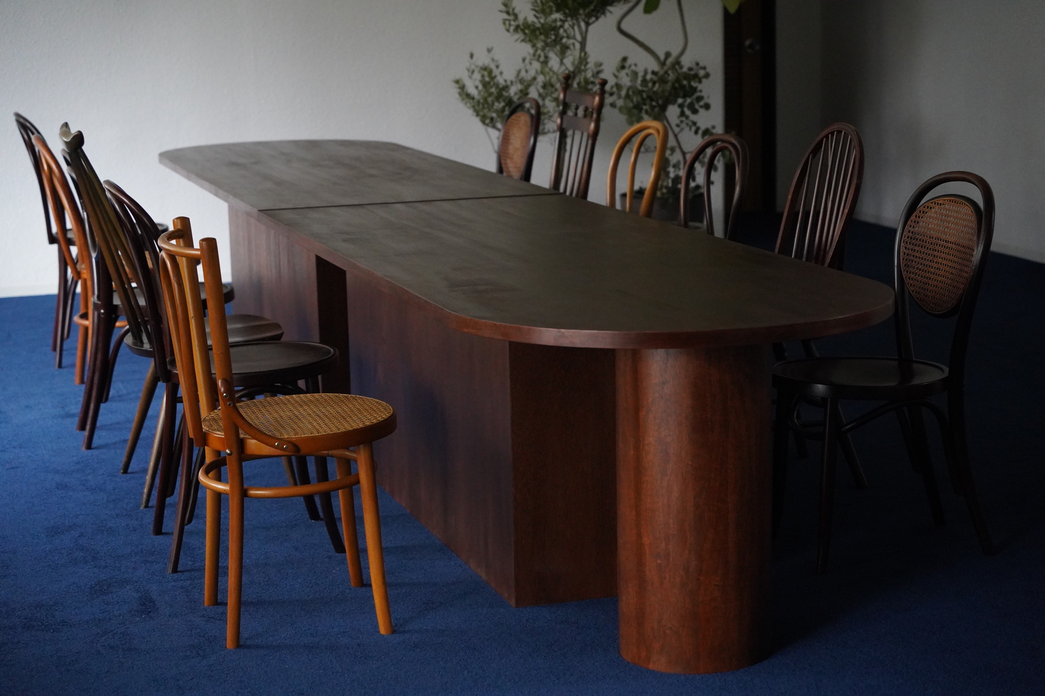
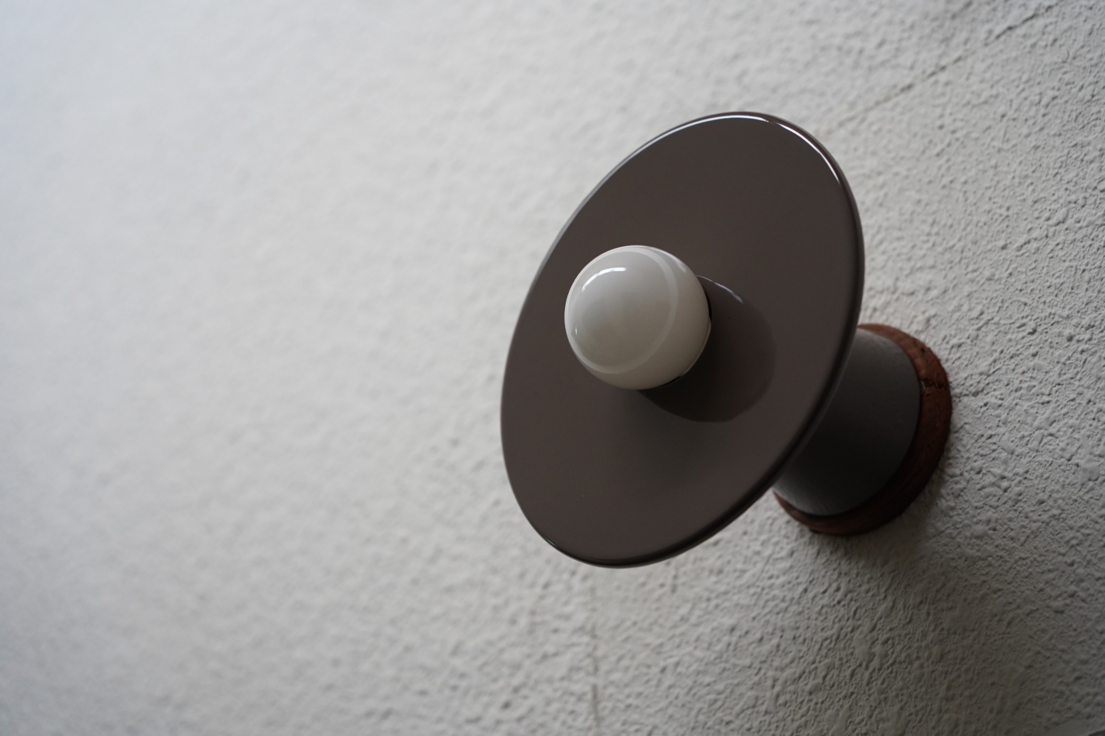
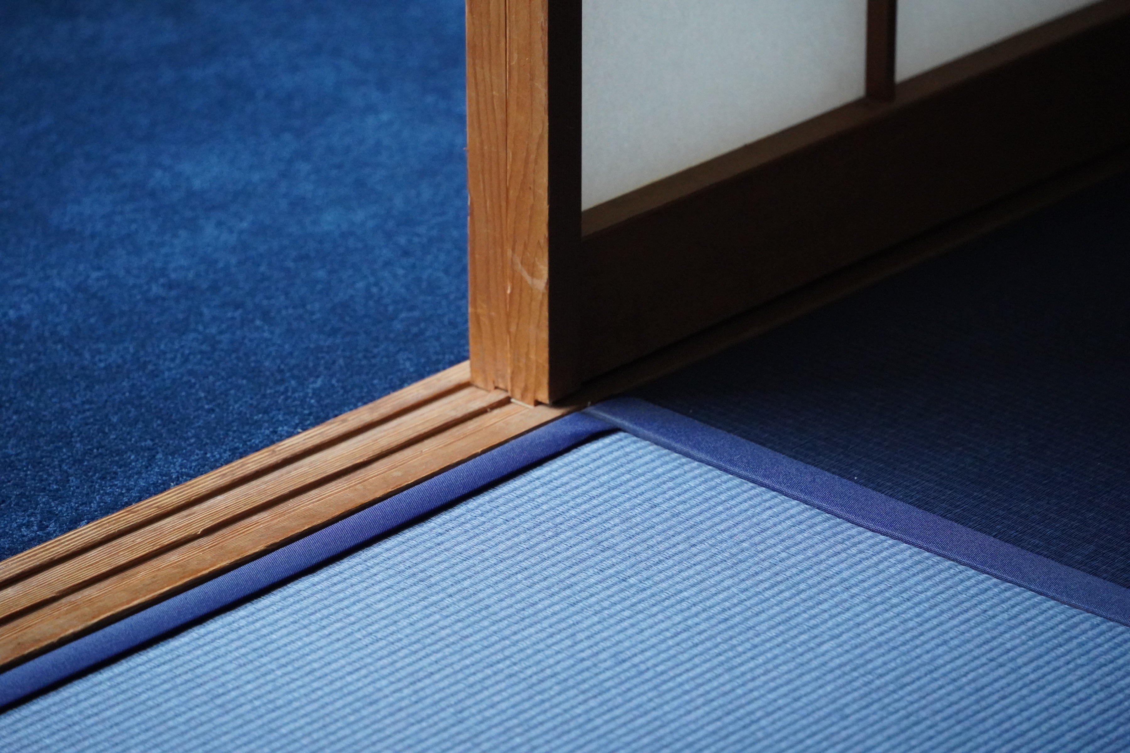
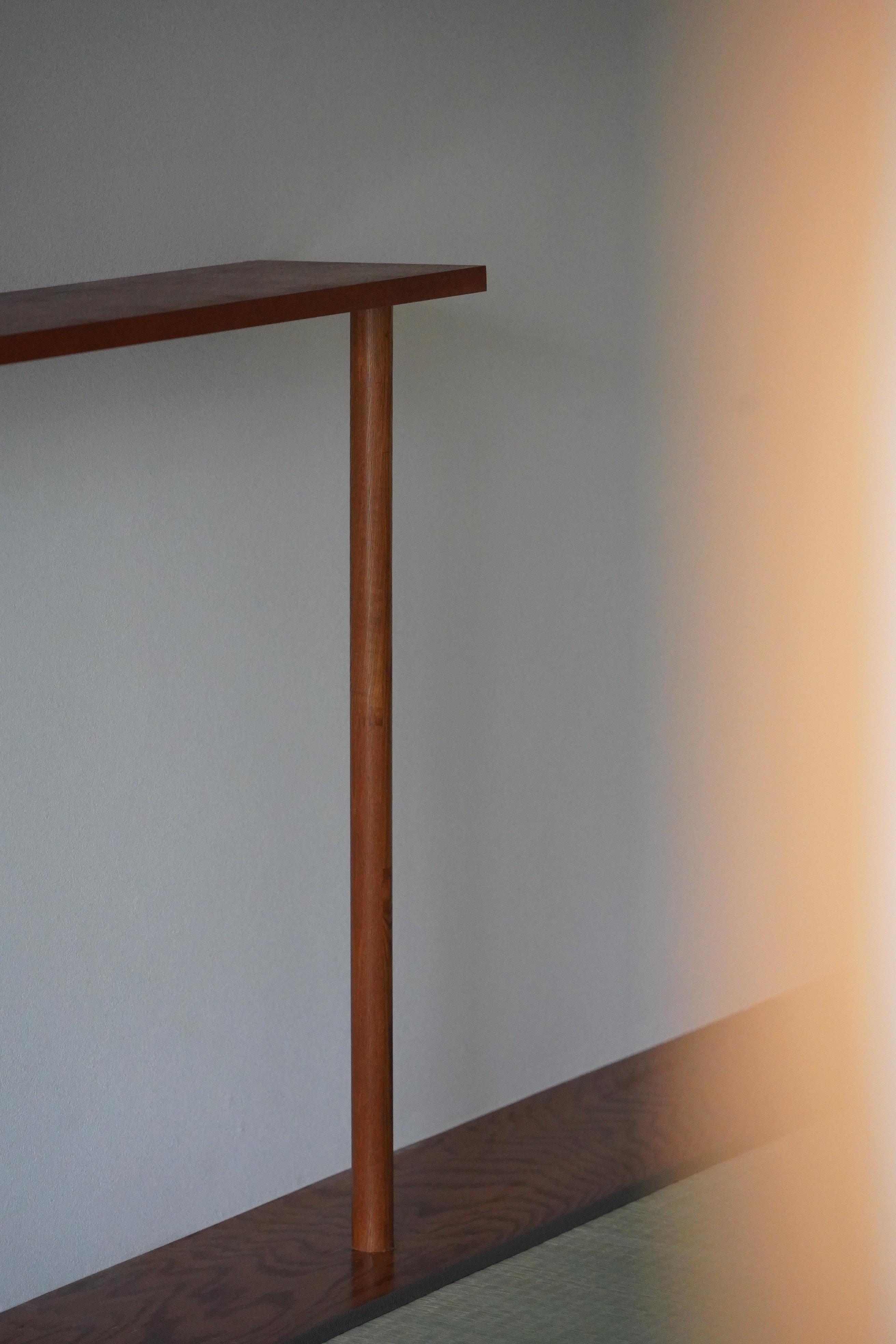
外部は赤レンガ、内部は白い壁面とチーク色の造作で構成されており、アアルトをはじめとする北欧建築の影響がうかがえた。
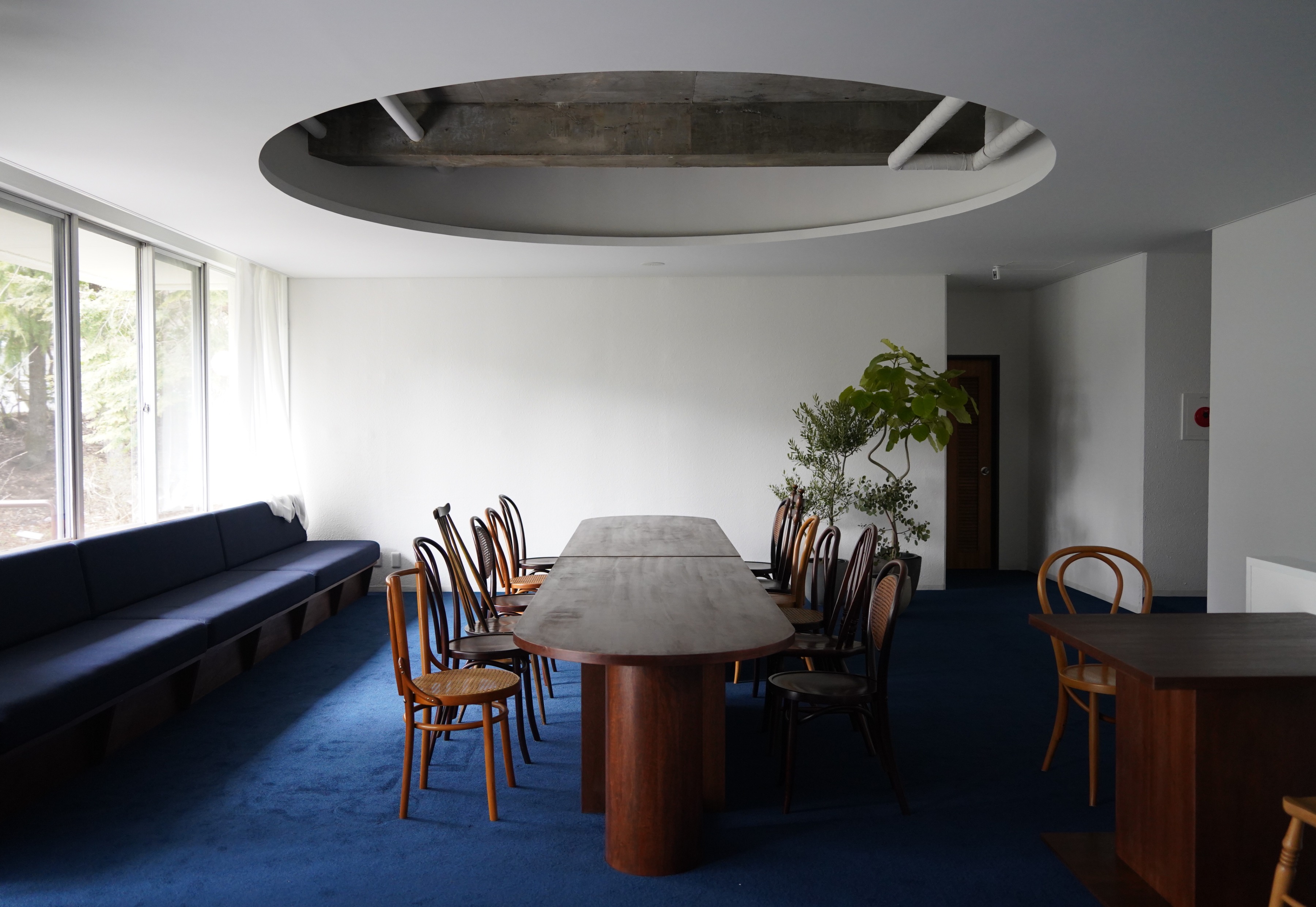
この背景を踏まえ、北欧建築でよく用いられる青をキーカラーとし、施設全体の雰囲気やデザインを構築した。
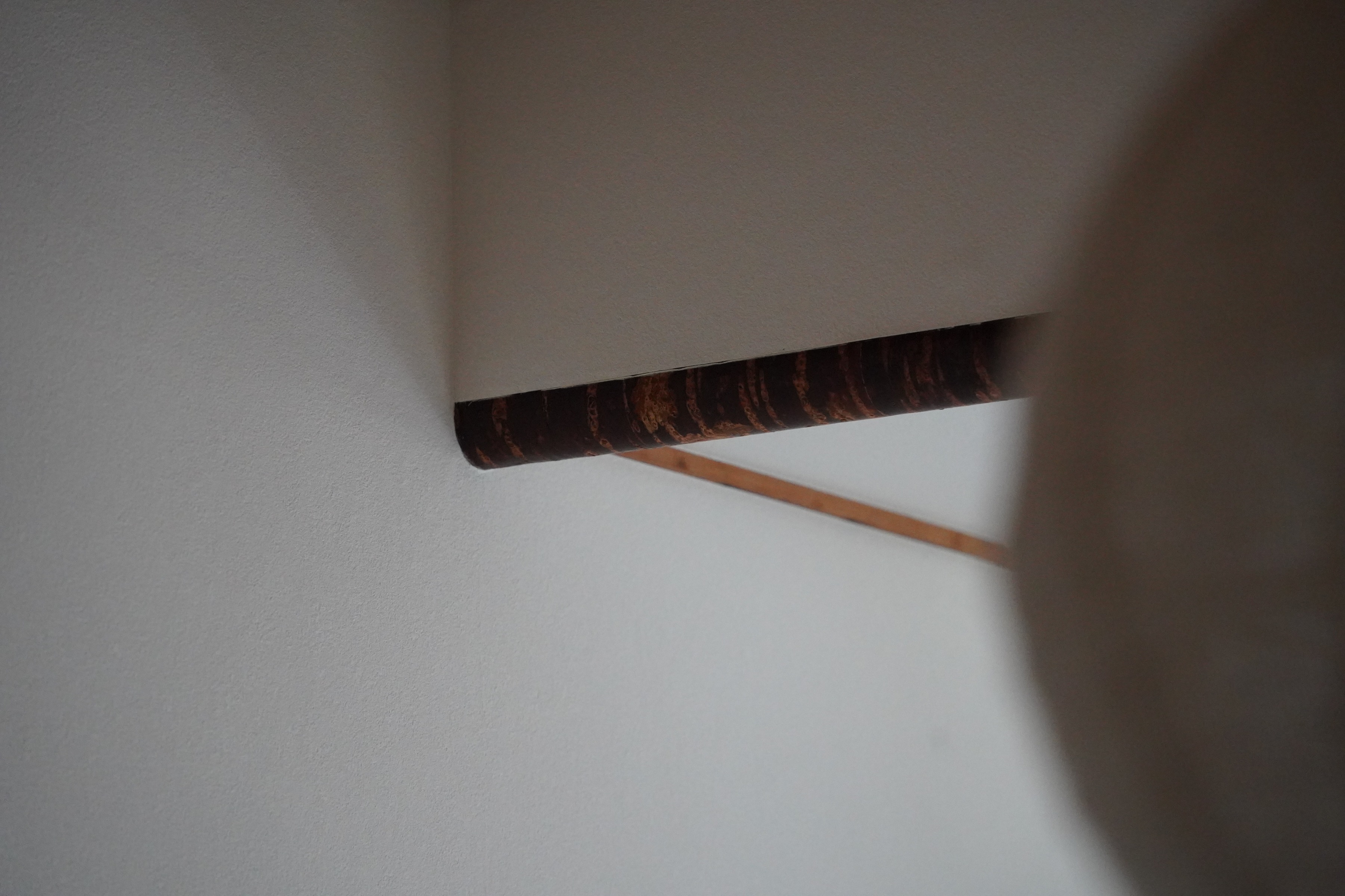
解体の過程で、かつての青色の塗装が現れたことからも、この推察は的中し、アアルトの「夏の家」を想起させた。
既存の意匠を前向きに受け入れつつ、トーン&マナーを整理し、現代的なデザインへと昇華した。
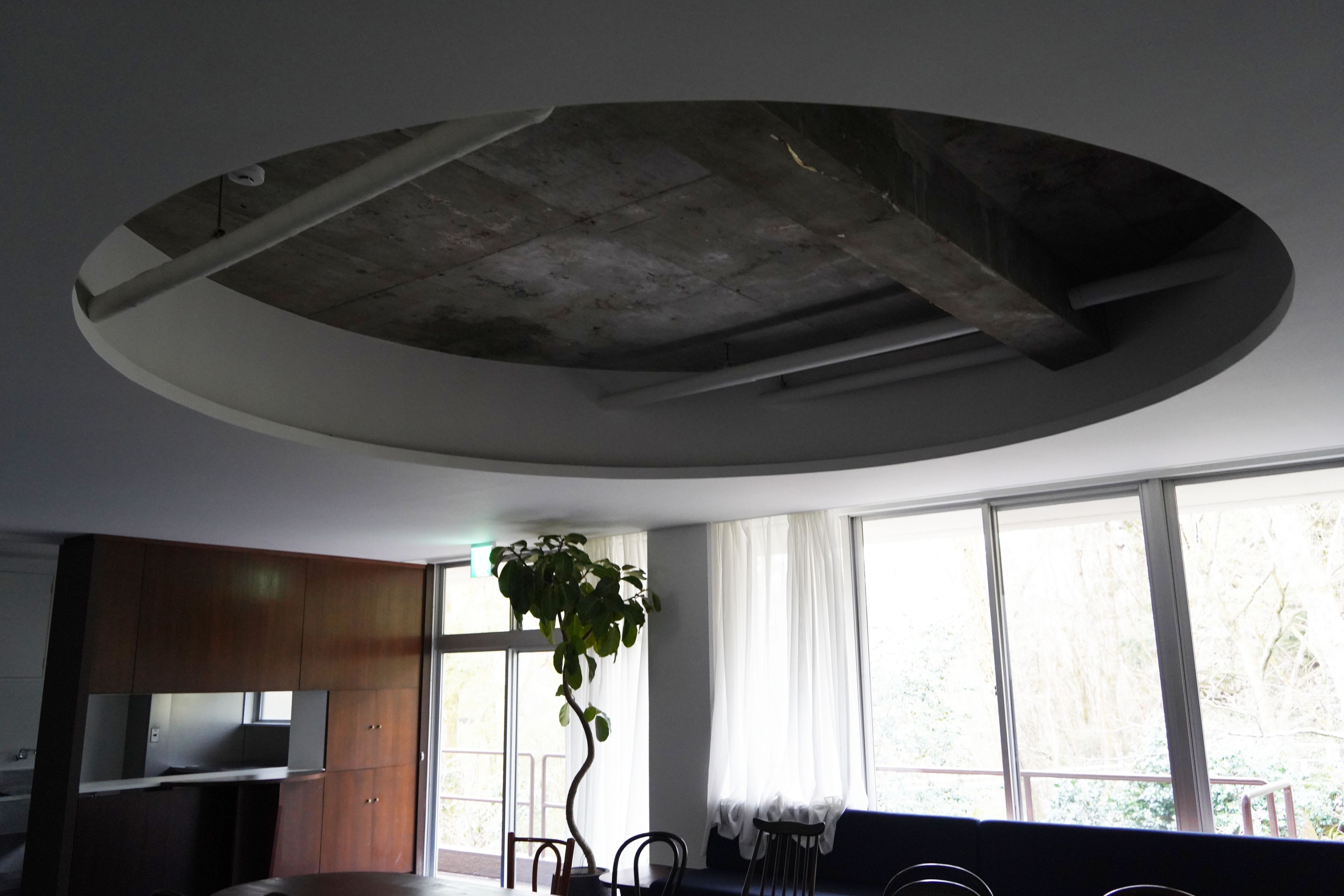
その象徴として、特徴的な天井を部屋の中心に据え、非日常を楽しめる隠れ家的な宿泊施設となるように計画。
所在地
施主
デザイン・設計
施工
グラフィック
写真
The project aimed to repurpose a recreation center located in Sengokuhara, a highland area of Hakone known for its rich natural environment, into an accommodation facility.
The corridors, which tended to be dark, were fitted with high sidelights from the north, while the bathrooms featured underlighting to softly introduce natural light.
The exterior was made of red brick, while the interior consisted of white walls and teak-colored woodwork, reflecting the influence of Aalto and other Scandinavian architects.
Given this context, blue, a color frequently used in Scandinavian architecture, was chosen as the key color to shape the facility’s overall atmosphere and design.
This inference proved to be correct, as traces of former blue paint were discovered during the demolition process, evoking Aalto’s Summer House.
Embracing the existing design in a positive manner, the tone and overall aesthetic were refined and translated into a contemporary design.
As a symbolic feature, a distinctive ceiling was placed at the center of the room, reinforcing the concept of a retreat-like accommodation where guests can immerse themselves in an extraordinary experience.
Location
Client
Design
Construction
Graphic
Photo