koti hakone’s branding / graphic

koti hakone’s branding / graphic
2024
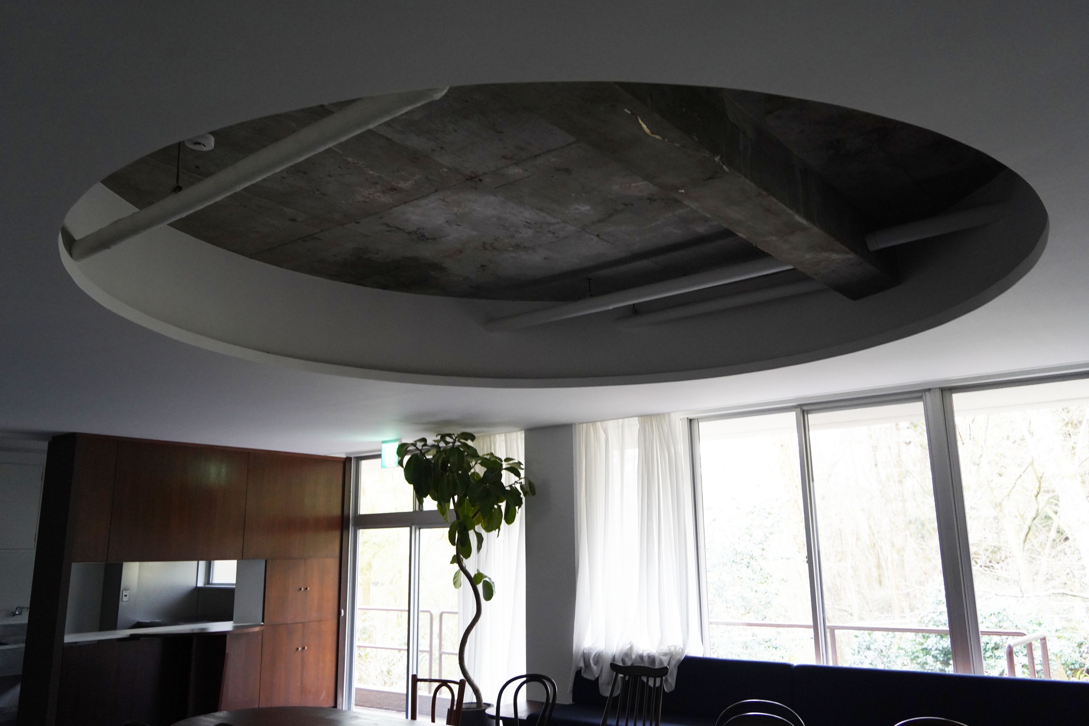
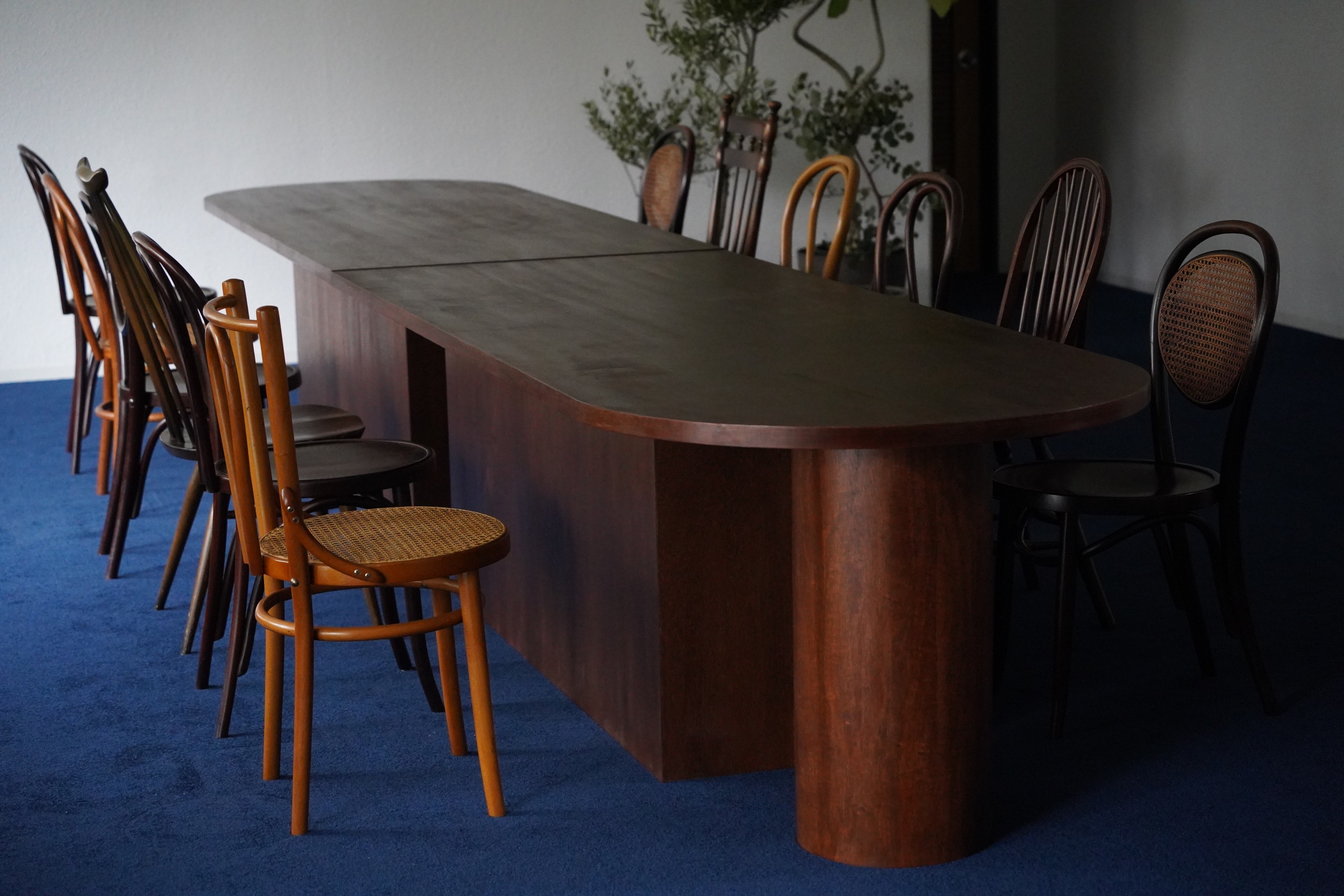
箱根の中でも自然豊かな高原が広がる仙石原に位置する保養所を、宿泊施設にするプロジェクトのサイン計画。
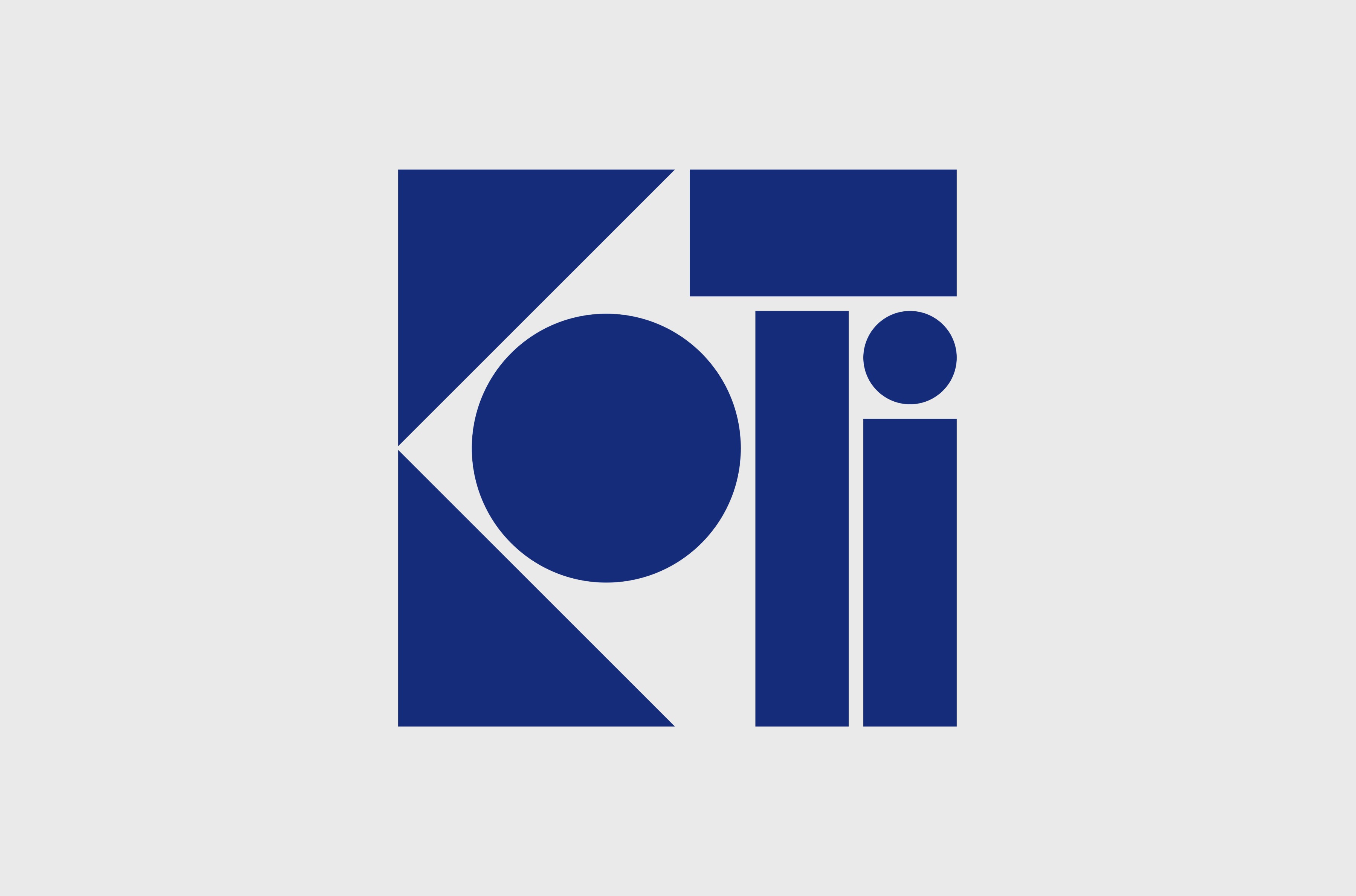
名前を「KOTI hakone」と名付け、フィンランド語で「家」という意味のKOTIを使った。
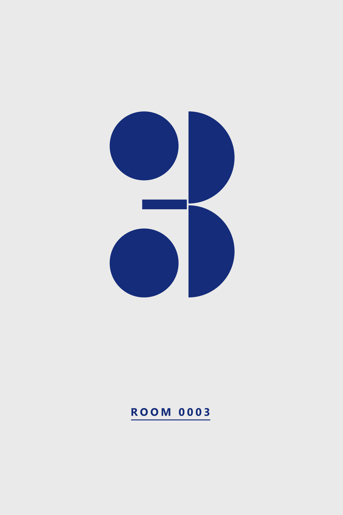
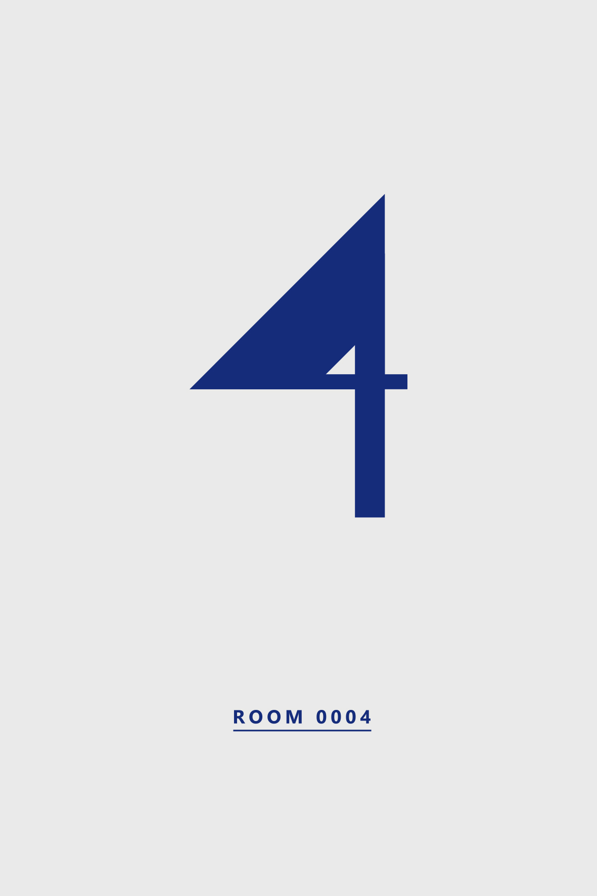
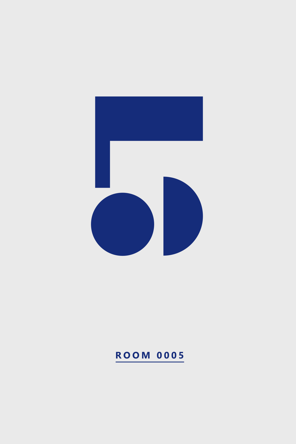
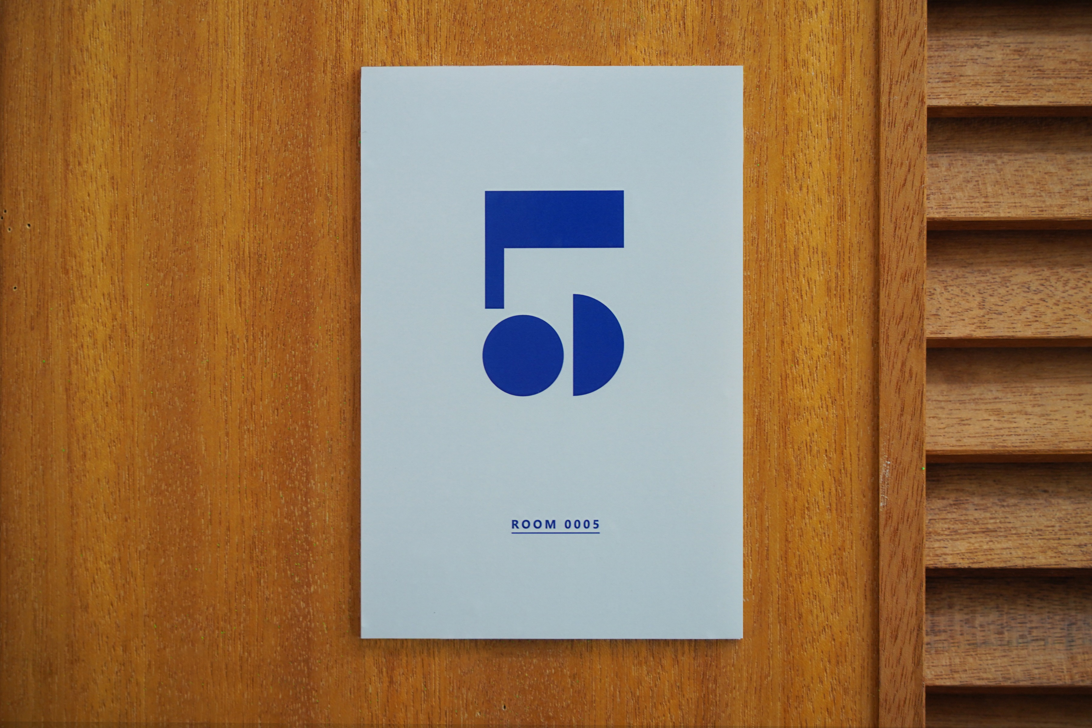
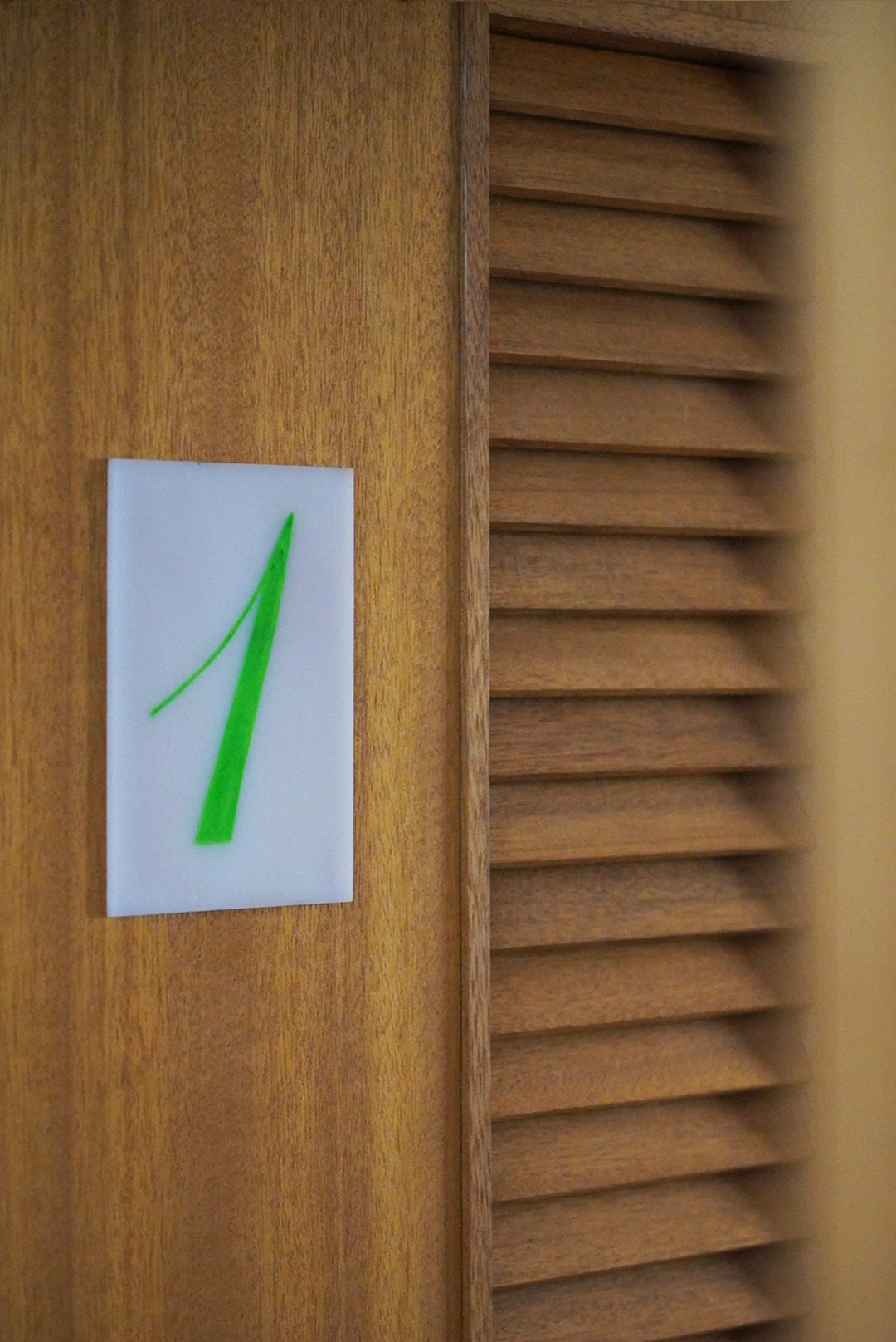
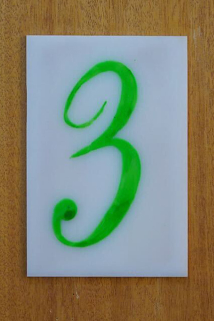
既存の北欧建築的な意匠を引き継ぎ、隠れ家的な宿泊施設を目指すキャッチーな文字。
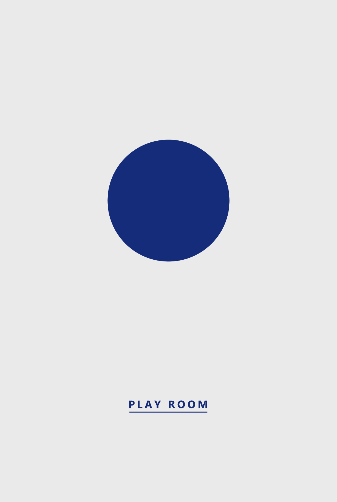
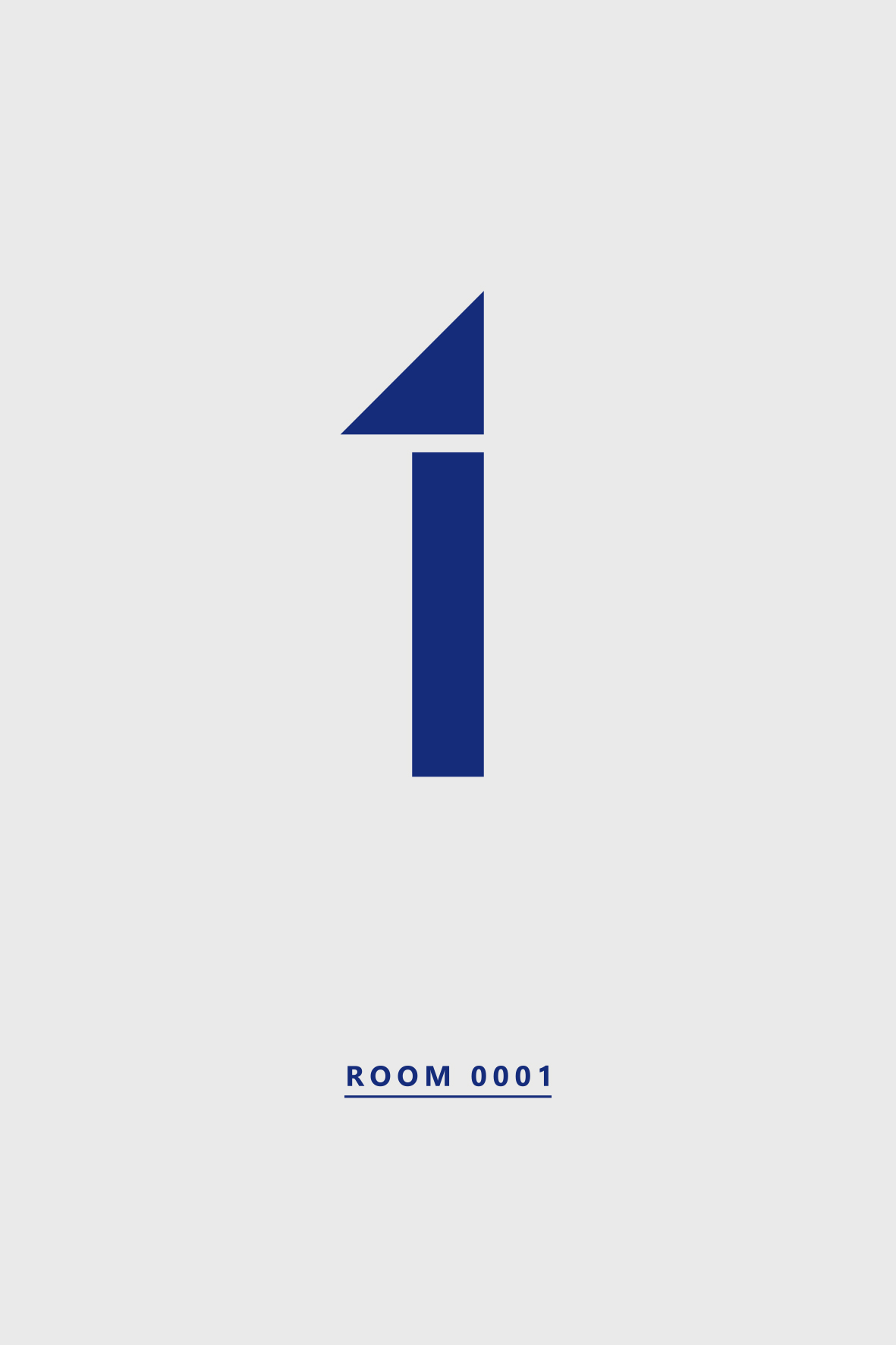
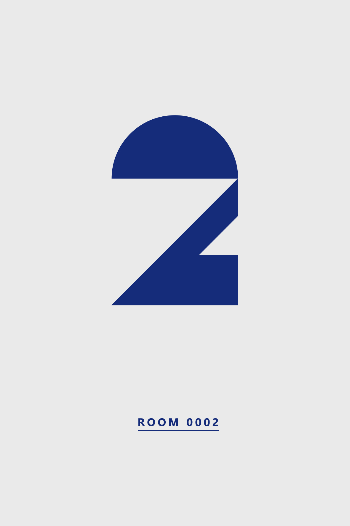
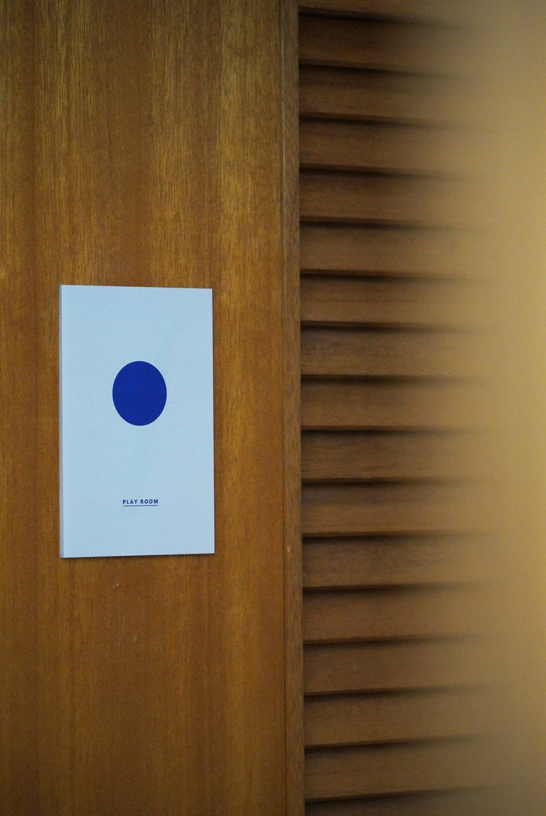
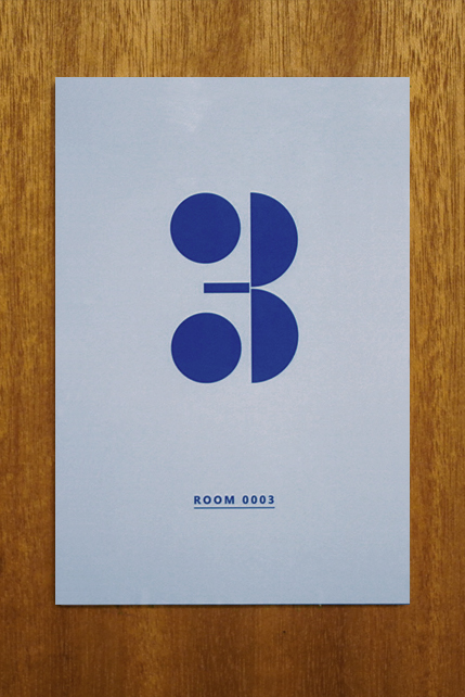
キーカラーは青色にして、グラフィックは幾何学で構成している。既存のサインを覆いかぶさるように新たなサイン設置していき、息を吹き込んでいった。
所在地
施主
デザイン・設計
施工
グラフィック
写真
Signage plan for a project to transform a recreation center located in Sengokuhara, one of Hakone’s most naturally rich highland areas, into an accommodation facility.
The name KOTI hakone is derived from the Finnish word koti, meaning “home.”
The typography is designed to be striking and seamlessly integrates with the existing Scandinavian architectural aesthetic, reinforcing the concept of a secluded retreat.
The key color is blue, and the graphics are composed of geometric elements.
New signage was installed to overlap and revitalize the existing signs, breathing new life into the space.
Location
Client
Design
Collaboration
Constraction
Graphic
Photo